SAXSPipe: Outputs
The pipeline is written in Python2 and uses analysis software from the ATSAS package by Dimitri Svergun’s group at Hamburg and our in-house image scaling and integration software SasTool. The software has been designed to be modular and easily adaptable, allowing the easy addition of new software tools as they arise. SAXSPipe is now regularly used during biological SAXS experiments to help users analyze their data.
SAXSPipe outputs data in organized as shown here:

SAXSPipe html table output overview:

The output analysis table has the following parts:
1) Initial data collection information – this section includes on the data collection such as the time it was taken, the sample and buffer filenames, the results of the scaling and integration of the images by sastool, and an Rg and distribution function analysis. Clicking on the .sub file name will bring up the text file with the scattering profile data which can be then opened in an appropriate program (for instance Primus or Graphit) for further analysis. The sastool log can also be accessed by clicking on the entries in the ‘Buffer(rejected) Sample(rejected)’ column. Log files from autorg and datgnom can be viewed by clicking on the respective links.

2) Image graphs- this section of the table features four graphs to help the user quickly identify problems with the data collection:
- a. The variance of the scaled and integrated images from the buffer and sample data collections, allowing for the rapid identification of radiation damage and other problems like air bubbles. Horizontal dashed line shows the limit above which the images will be rejected.
- b. A comparison of the averaged buffer and sample scattering (tot files), which allows the user to quickly see how strong the sample scatters
- c. Low q (<0.2A^-1) comparison of the subtracted sample scattering profiles for each image, again allowing the user to identify radiation damage over time
- d. A graph of the change in Rg over the image series

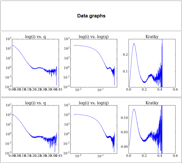
3) Data graphs- This section contains a series of basic SAXS data analysis graphs:
- a. log(i) vs q plot- the usual SAXS analysis graph
- b. log(i) vs log(q) plot- As above but with the lower q region emphasized
- c. q2 x I(q) vs q plot (Kratky plot) - Protein flexibility/disorder graph
By clicking on any of these plots you will get their interactive version.

4) Data analysis graphs - results of automated data analysis:
- a. Guinier plot – the Guinier region of the plot used for Rg calculation
- b. P(r) distribition - the P(r) function calculated by datgnom

5) Row analysis - comparison of data from one concentration series:
- a. sub(n)/sub(1) – ratio of concentration series datasets with the first dataset. This graph will show any concentration effects on the scattering.
- b. Rg - a graph of the change of Rg across the concentration series
- c. I0 - a graph of change of I0 across the concentration series

